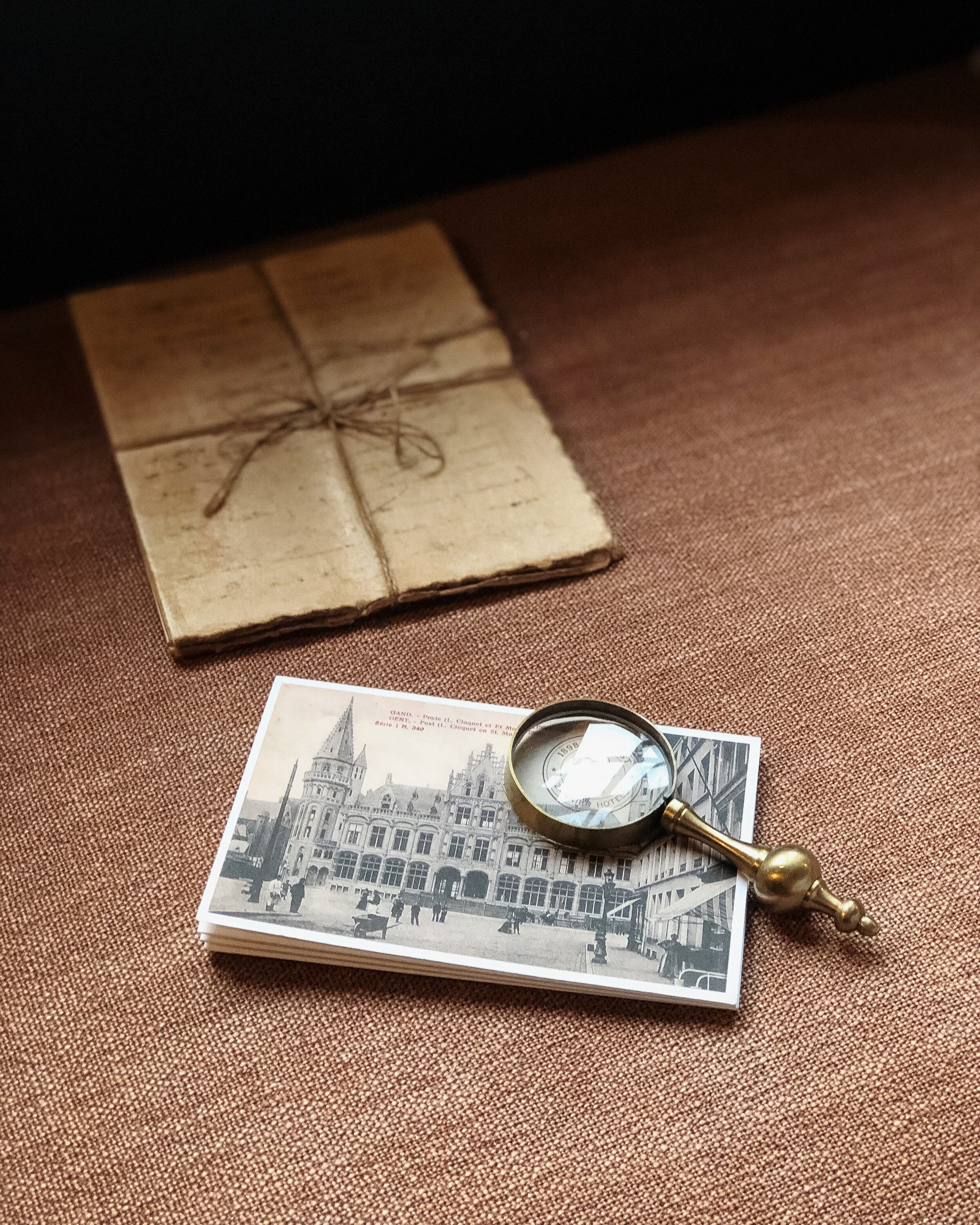
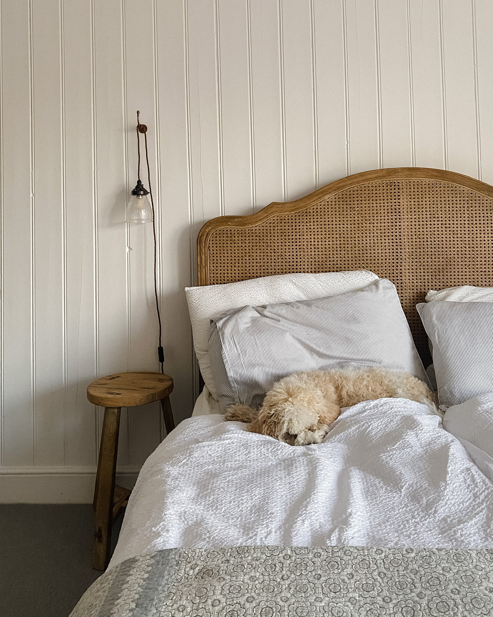
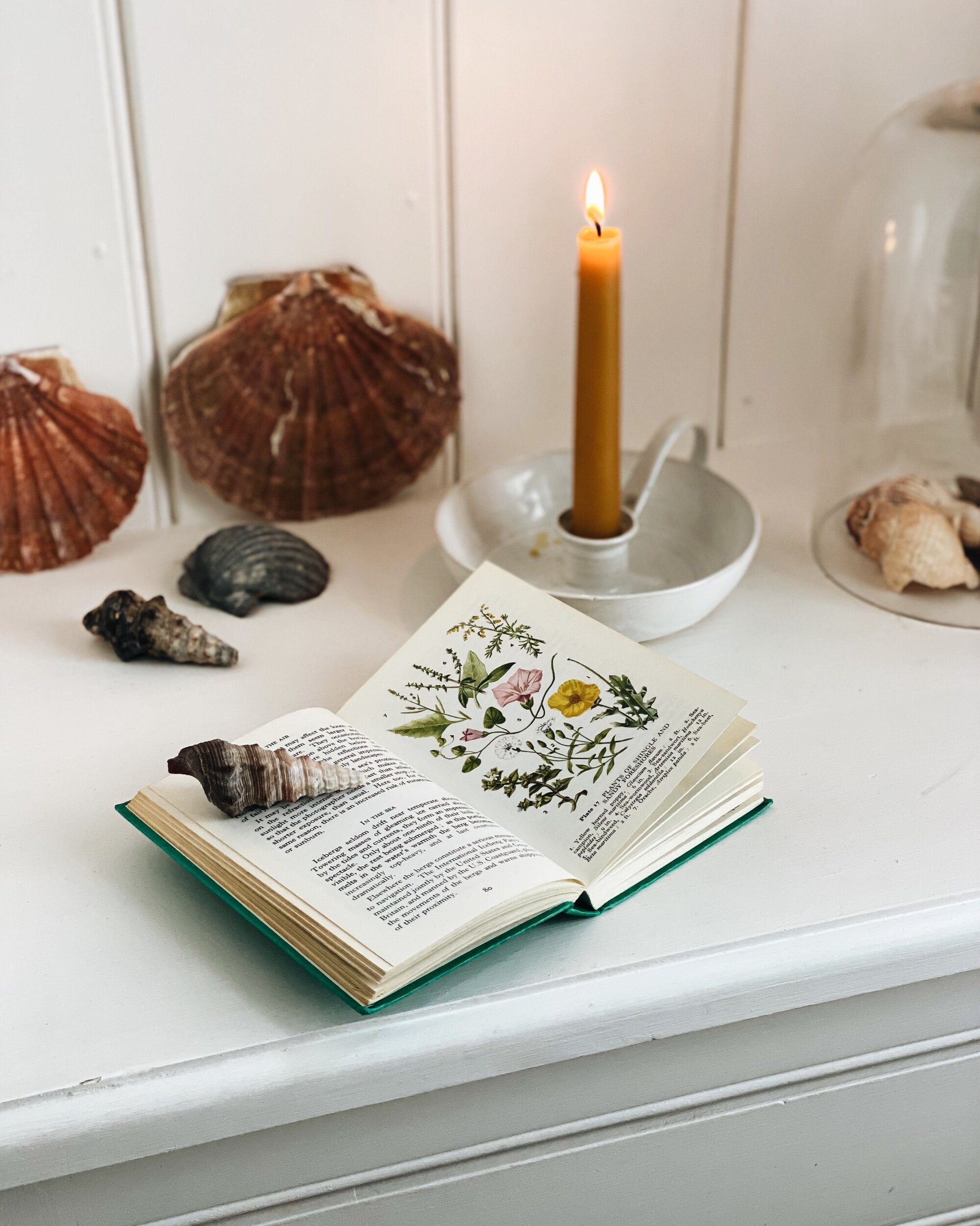
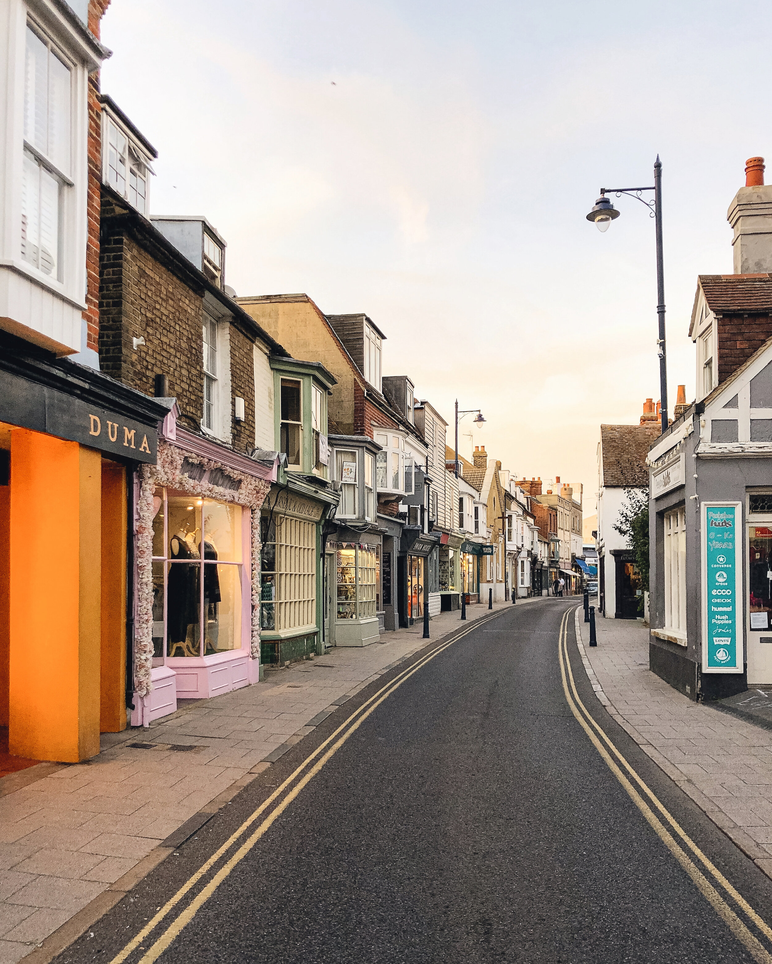
One of the main things I’ve learned in my time on Instagram has been that you don’t need to be a professional photographer to be able to take good photos that will resonate with people. Most people these days carry a smartphone in their pockets, and that’s really all you need to get started on Instagram. There are a few basic things to consider if you want to take “good” photos, and by that I just mean images that are in focus and where you have thought a little bit about lighting (which doesn’t mean your photos have to be super-bright — I often prefer slightly moodier, shadowy photos) and composition (i.e. where the different elements in your photo are placed and how they relate to one another).
Photography literally means “drawing with light”, and lighting is really key. As a general rule, I prefer to take photos in natural light (so if I’m indoors, I will try and make sure any artificial lights are switched off, so the photo doesn’t look too yellowy), and ideally on an overcast day when the light is soft and you can see everything clearly. That’s just a matter of personal taste and knowing what works best with the kinds of things I tend to photograph. In hotter, sunnier climates this might mean trying to take photographs around dawn or dusk, when the light is softer. It depends on what look you’re after.
The way I try and get the exposure right as I’m taking the photo is simply by tapping on the brightest spot on the image on my phone screen and moving the exposure slider up and down so that the image is not overblown. (It’s usually easier to make under-exposed photos slightly brighter when you’re editing them than it is to restore detail to over-exposed highlights.)
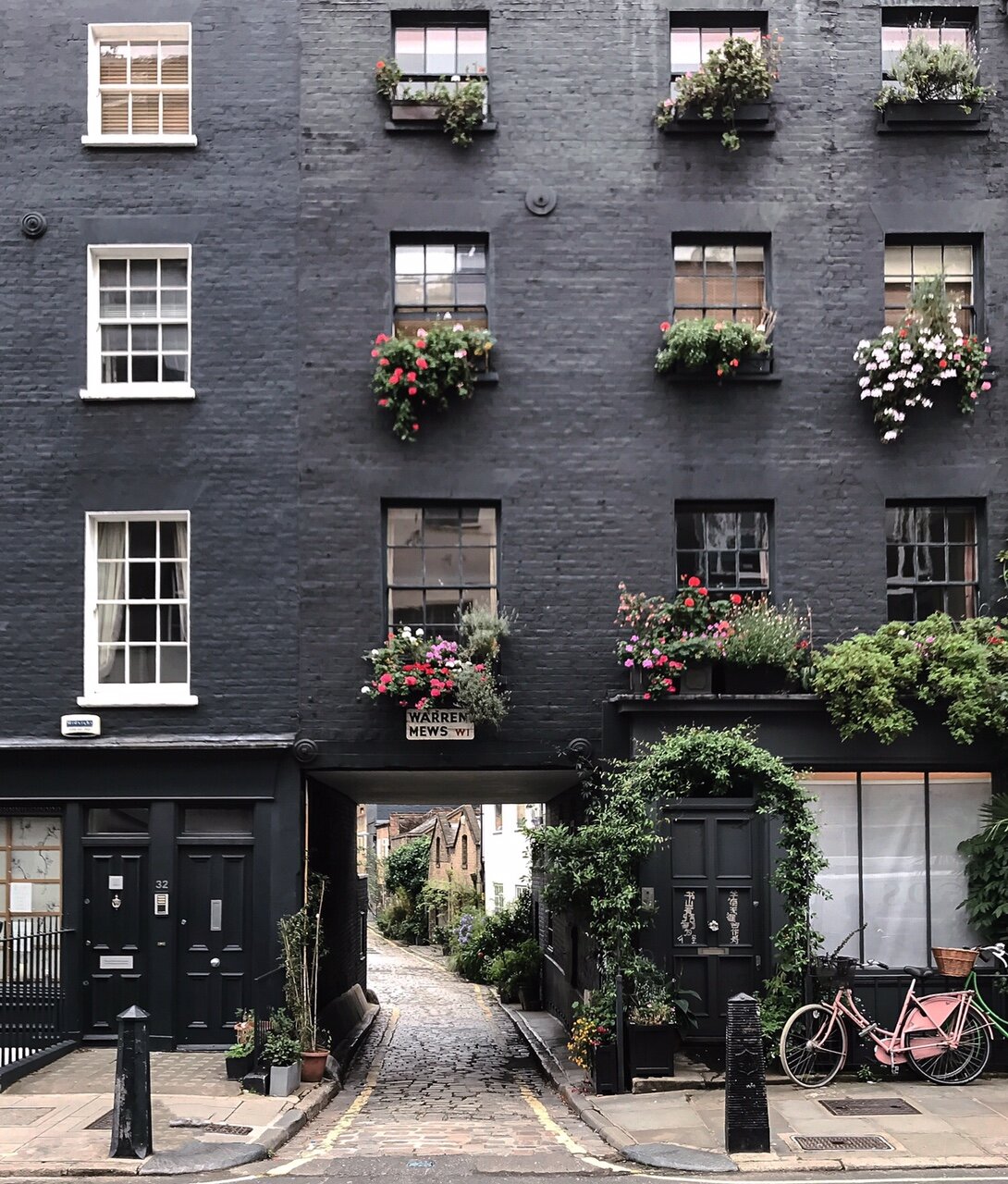
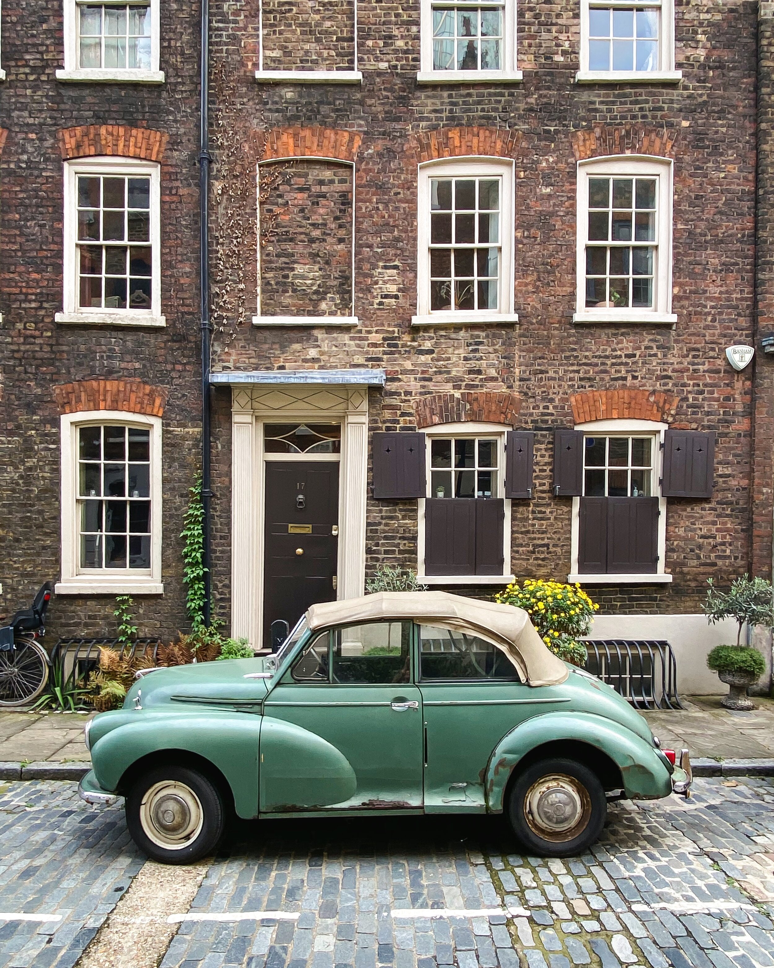
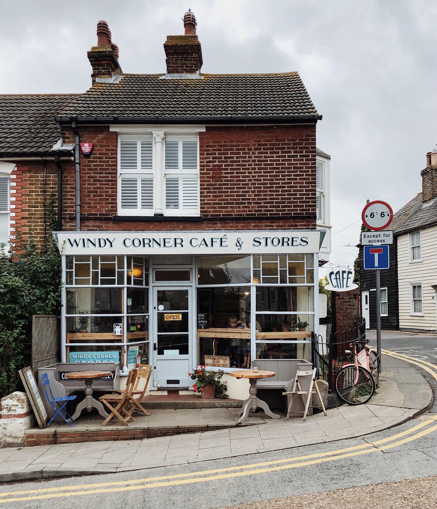
If I’m photographing buildings (and I usually am!) then I’ll make sure my phone screen aligns as much as possible with the vertical lines, rather than tilting it at an angle, so that my image will look as straight-on as possible. Sometimes, particularly in London, where the streets are narrow and you often can’t take enough steps back to capture the full facade of a building straight on, this means taking a photo of a building on a side angle so that you can capture the scale without needing to tilt the phone back. Or it may mean taking a photo that’s not full length, but focusing in on a detail — a doorway, for example, or just some of the facade. I usually have the gridlines turned on when I’m using my phone, as it helps you see whether your lines in your photo are straight.
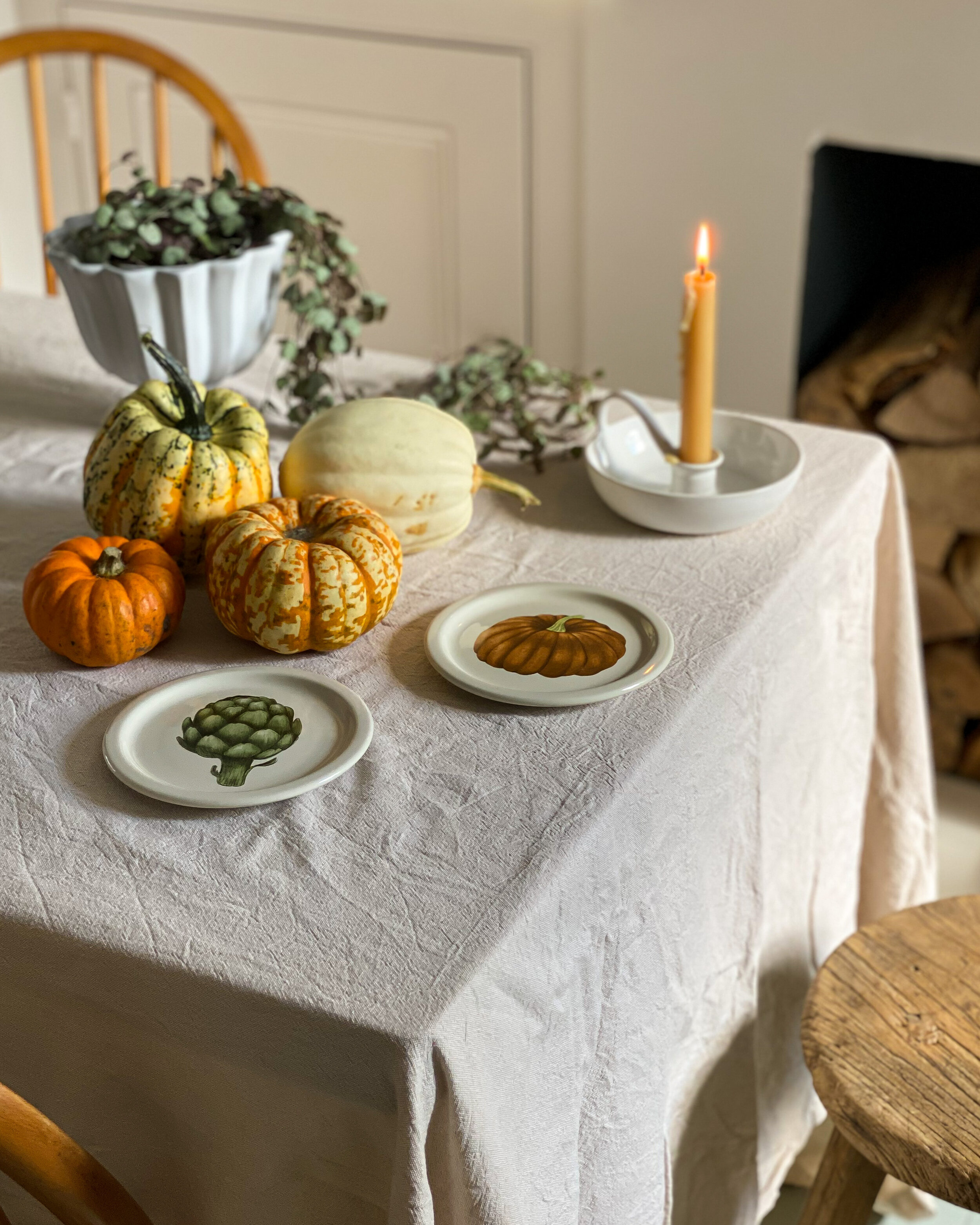
If I’m photographing things where detail is important, for example interiors or food, I might use Portrait mode on my phone camera, as it allows the subject of your photo to be the main focus while making the background recede and blur a little bit. It can be a really good way of capturing and evoking a mood.
Keep your hands as still as possible so the phone doesn’t shake while you’re taking the photo, as this will cause blur. Take a number of photos, maybe with different angles, so you can see what looks best, and remember that your best photo is rarely the one you took first. With smartphones, we’re so lucky in that we can take a dozen photos if we want to, and be able to tell instantly which are best and delete the rest.
In terms of composition, I usually think about what seems most striking to the eye. What is my eye naturally drawn to? There’s lots of advice out there about leading lines and the rule of thirds — they’re really just ways you can think about how you divide up the space in your frame, and how you can create an image where the eye follows a particular path. For the purposes of Instagram, I usually take photos with a 4:5 ratio rather than a square or a landscape orientation, as this takes up more “real estate” on someone’s screen when they’re scrolling, and also because I tend to photograph buildings, which are vertical. But remember that if you take photos using a 4:5 ratio, what you will see on someone’s gallery as a whole is a cropped square version of your original photo — just something to bear in mind when you’re thinking about how your gallery hangs together — it may mean you want to make sure there is some empty space around the focal point of your image, so the viewer can see a full version of your subject when viewing your gallery.
Thinking of your Instagram page as a gallery that will be viewed as a whole by someone who clicks on your profile helps you to curate your images — it’s not just about a single image but about the way in which the images look next to each other and hang together. And depending on what you’re using your account for, it may not be that important. But if your eye for aesthetics is important to what your account is about (say, if you’re a photographer or an interiors stylist or you work in an industry where visual taste is important), then it’s worth spending some time thinking about your images and how they work together. That’s probably a whole other post so stay tuned!
